

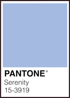
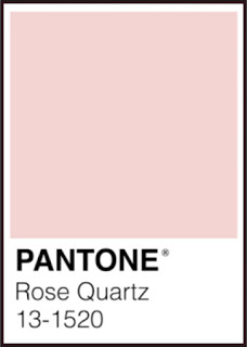
It was with great fanfare that Pantone announced: ‘For the first time, the blending of two shades – Rose Quartz and Serenity are chosen as the PANTONE Color of the Year‘ for 2016. As has come to be expected there was an immediate flourish of social media and the subsequent announcement from industry insiders announcing their partnerships and ‘Color of the Year’ themed and coloured products. Sephora has introduced the ‘Sephora + Pantone Universe Color of the Year 2016’ makeup collection including Rose Quartz or Serenity coloured lipsticks. Perfect for those occasions when you cannot decide whether you want that healthy rosey glow or that ‘perhaps I should not have fallen through the ice and frozen to death’ tint on your lips, I say with no small degree of sarcasm. Kitchenaid was quick to announce that – thankfully – Color of the Year versions of their iconic stand mixer are available, though the Guava Glaze, a warm pink tone based on Rose Quartz (likely so named for certain reasons involving lame application of Copyright and Trademark laws), will not be available until summer 2016. Quelle horreur! To say that The Ruggist is underwhelmed by this selection and its seemingly apparent lemming like following would be an understatement.
[wc_row]
[wc_column size=”one-half” position=”first”]
[/wc_column]
[wc_column size=”one-half” position=”last”]
[/wc_column]
[/wc_row]
Do not mistake this to mean I dislike either colour individually or collectively for that matter. I’ve long been a fan of the colour generally described as pink, light red for those with a sense of humour. And as for blue, it is something I can take or leave depending on the precise hue, though I’ll freely admit to being a fan of those tending more toward the greener/yellower variety. My displeasure comes from several fronts, foremost amongst them is that this is being lauded as innovative by people who should be defining their own aesthetic.As a student of colour I could not help but wonder from where this idea came. Having myself sat through many a tedious brainstorming meeting I can imagine what the scene must have been like. Experts in colour forecasting (it’s a thing) sitting around discussing (or is that defining) trends. Someone suggested the colour pink! And then, just like that scene in the film ‘To Wong Foo, Thanks for Everything! Julie Newmar’ when Welsey Snipes’ character helps them formulate the ‘Red and Wild’ theme for the annual Strawberry Social, an exasperated intern eager to be doing anything but listing to a committee deliberate design suggests: ‘What about blue?’ The committee chair then asks, with that subtle nod conveying their extreme interest: ‘What about blue and pink?’ It’s almost as if it could be satire in the vein of ‘Office Space’.
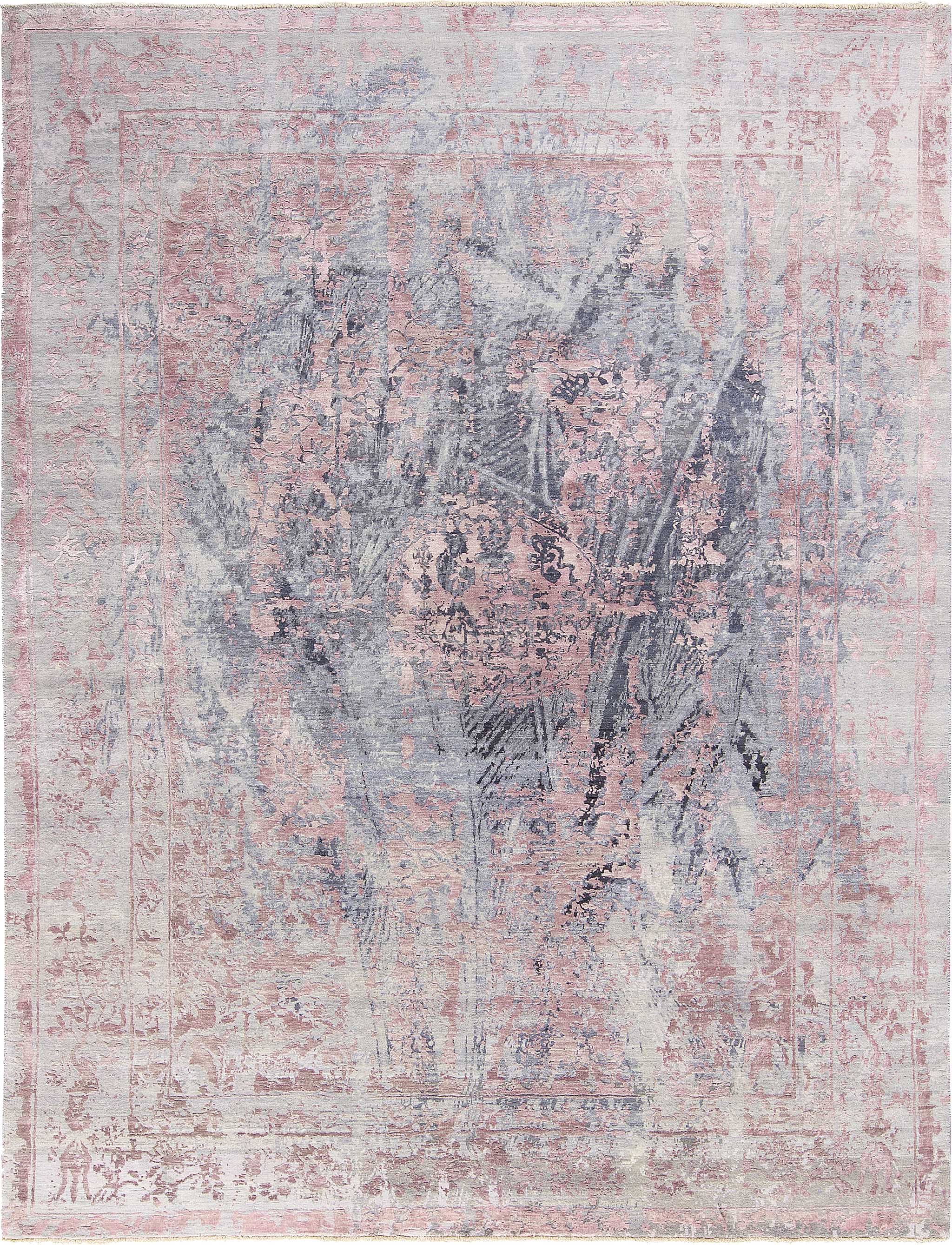
But where did the idea for pink come from? There is a high degree of it already in use in rugs and carpets, but I don’t think we get to pretend that rugs and carpets are now defining the whims of the colour industry. No, that it not our lot. (Or is it? We, rather THIBAULT VAN RENNE got it right over a year ago.) So where did it come from? Perhaps it’s a tint of last year’s colour of the year Marsala, or at least a very close approximation. I know the colours are actually different (Pedants of the design world unite!!), but I assert they are all but indistinguishable by the masses under most real world scenarios.
[wc_row]
[wc_column size=”one-half” position=”first”]

[/wc_column]
[wc_column size=”one-half” position=”last”]

[/wc_column]
[/wc_row]
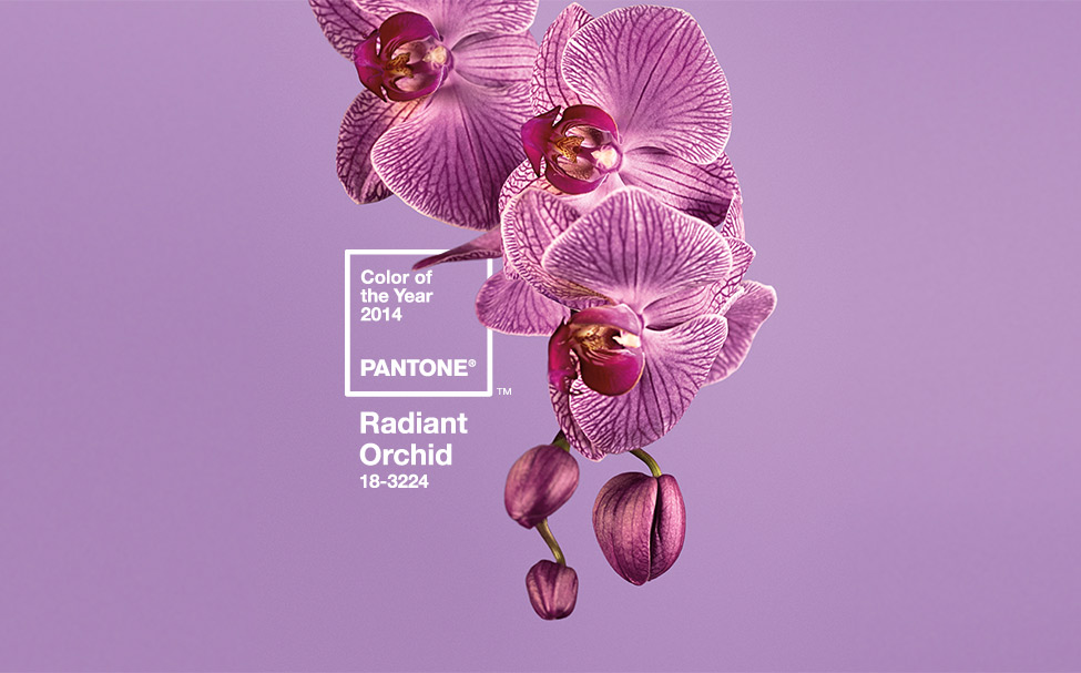
Furthermore, Pantone asserts that the ‘Color of the Year’ is actually a ‘blending of two shades’ – something only people buying into the bullshit corporate intellectual backstory about gender equality and diversity seem to notice. Do you know what you get when you blend Pink and Blue? You get something akin to a tint of Pantone’s 2014 Color of the Year: Radiant Orchid.
To be fair and facetiously erudite, at least the fine folks over at Pantone took the time to actually select a colour unlike Benjamin Moore who instead opted for ‘Simply White’ as their colour of the year for 2016. Described by the firm as ‘Fresh as the first snowfall, this clean, crisp, multi-purpose white is a perennial favourite for trim, ceilings, and walls.’ A perennial favourite; something that we use every year is the colour this year, moreover it’s white. That’s asinine. White is used so extensively in the design industry, it’s like oxygen to use a measured dose of hyperbole. In short, I find that these forecasts, trends, or however you’d like to describe them are all becoming a bit passé. I have protested the lack of colour, err, more accurately the overuse of certain colours, for years and now find that I am most pleased from a design perspective when greeted by the unexpected as opposed to the homogenous. Trends are great overall and it is an exceptionally rare reward to be at the leading edge defining a trend, but for the love of all that is beautiful, don’t start making Pink and Blue (with White?) rugs now as you’re already behind the curve. Or perhaps I doth protest too much, methinks. I mean, it’s not like either one of them picked beige…Yet!!