
When I took my first job in the rug and carpet world – as a porter no less – I was still full of that invincible hubris and newly minted air of superiority that makes a more aged version of myself now cringe. Fresh from university and full of confidence, I was certain I was the first person ever to discover that design functions in rote, methodical cycles. I marvelled as the past returned to the present only to once again fade into oblivion. This was the thinking that compelled me to highlight ‘Circles’ in the Summer 2017 Issue of Rug Insider and it remains a strong influence in much of my critique. New and exciting is hardly new, nor is it exciting when it’s been done before.
Though I was prescient of the return of the past I knew from old design magazines and quaint television programs in syndication, at the age of twenty-two (22) I had not yet fathomed there would be a point in my life when the return would be that of things I witnessed in my own lifetime. Perhaps this is the tragedy of youth, wasted as it is on the young, but I digress. In a sort of meta kind of way then it is that the past returns to collide with the present as we examine a convergence of the cycles of colour and our tolerance for pattern with a look at two (2) very distinct carpets which I argue accomplish more or less the same thing despite their outwardly different aesthetics.
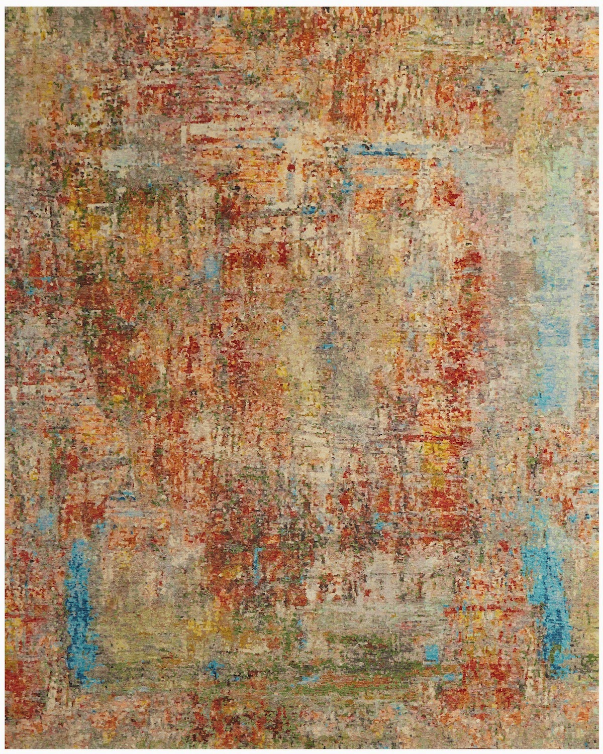
Made in Nepal of Himalayan sheep’s wool and Chinese silk Tibetan knotted to a cotton foundation, ‘Soho’ from the ever creative mind of Wool and Silk‘s Erbil Tezcan is an archetypical carpet of the natural progression of pixel-by-pixel, knot-by-knot carpet design that had until late dominated the vanguard of carpet design. Technological advances – namely but not solely the work of Alternative Technology of Kathmandu with their Galaincha software – made possible here at the dawn of this century the ability to create intricately detailed designs faster, more efficiently, and with greater precision than heretofore possible. In doing so the oft imitated work of Tezcan pushed the abstract to its limits inundating the floor with an exuberant palette of colours akin to a mélange of the artistic works of Gerhard Richter and Jackson Pollack. Devoid of obvious patterning, the carpets are nondescript save for perhaps a resemblance to end-of-the-broadcast-day television static of a bygone era or perhaps a heavily distressed well patinated painted wall. This genre of carpet design allows for an embrace of colour without the burdensome requirements of a previously defined historic carpet style; appealing such as it does to those who find beauty in chaos – structured, predetermined, and defined as it may be.
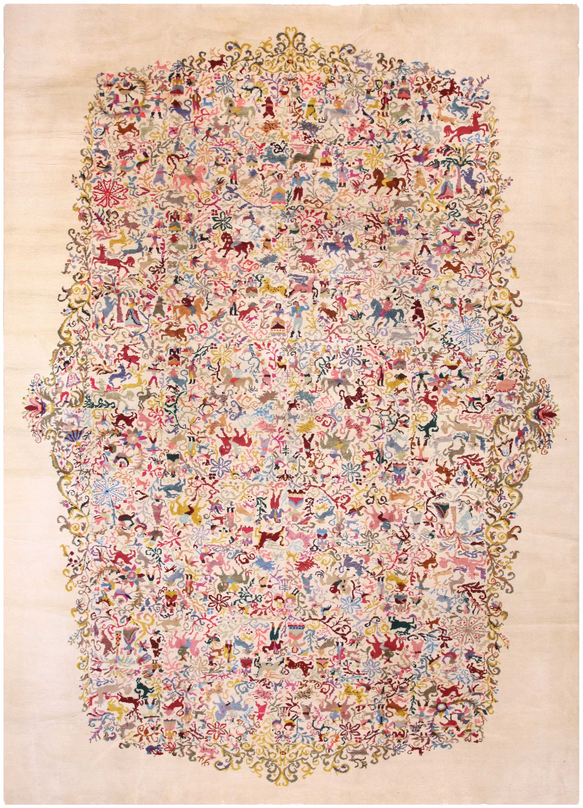
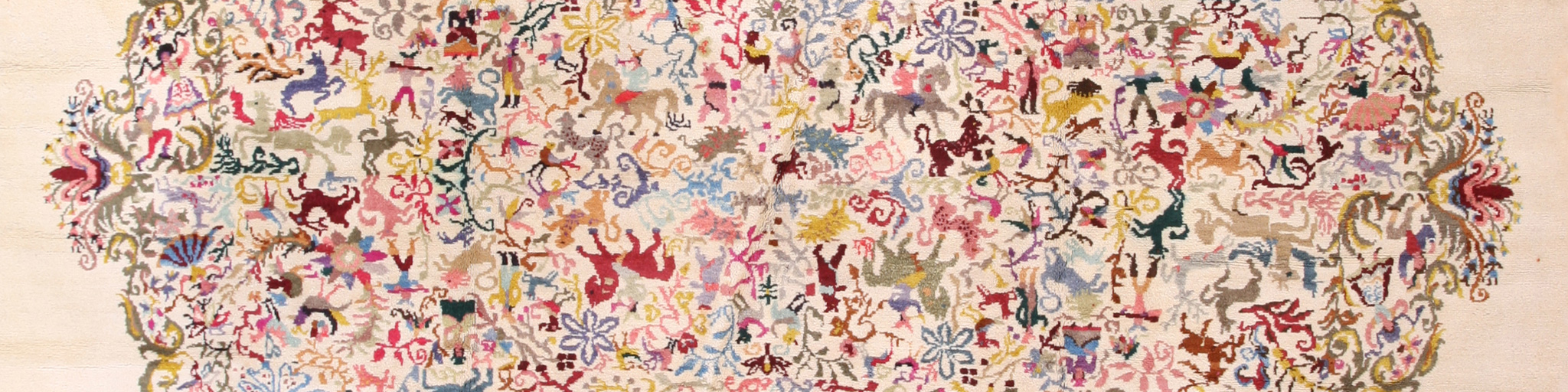
In 1939 Hungarian Olga Fisch (1901-1991) emigrated to Ecuador ahead of the political instability then enveloping Europe. As an artist and also a collector of folk art – a genre I greatly admire – Fisch took to the arts and crafts available in the local marketplaces, finding inspiration in their simple, honest forms. At the same time, the Paleolithic cave art discovered in Lascaux, France was about to become incredibly influential in the then (and now) burgeoning mid-century art scene. So it was at this confluence of political unrest, a transplantation to a so-called less sophisticated place, and a newfound reminder that humankind has long attempted to document the world through art, Fisch found herself inspired to create carpets uniquely her own.
‘Caceria’ as shown above is one such carpet. Made of domestic Ecuadorian sheep’s wool and knotted using a Turkish (also known as a symmetric or Ghiordes) knot on a cotton foundation, the design is fanciful, pictorial, illustrative, and full of life and colour. Heightening the overall fussiness of the design is the stark solid colour border which transitions into the figurative animal and human forms of the main pattern though an elegant filigree of vines and floral elements. It’s a cacophony of pattern and colour which in detail reveals horses, horseback riding, and dancers to name just a few, but from afar tends to blend into not much more than a fuzzy static of colour not entirely dissimilar to ‘Soho’.
‘Scoff, scoff! The designs are patently different!’ exclaims an imaginary reader who is of course correct. But what do they do for a space? What is the function of either ‘Soho’ or ‘Caceria’ in a space? What is the visual impact? Those are the questions to be pondered.
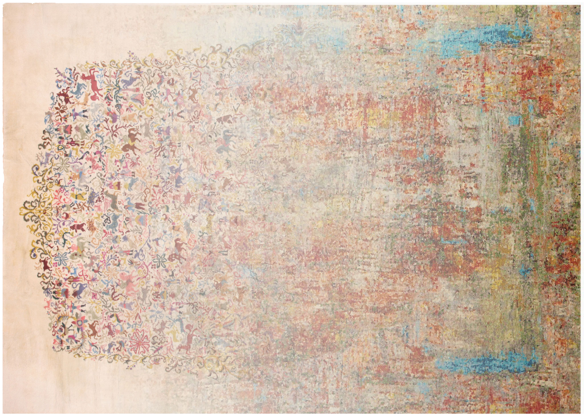
What intrigues me most about these two (2) carpets is that they both serve to add large doses of colour to a space without being overt or domineering on their own accord. In abstract both carpets express their uniqueness, but amidst a well furnished and appointed room, the carpet is merely one piece of the whole, adding nondescript colour for the casual viewer. ‘Soho’ may embrace a modern artistic style, whereas ‘Caceria’ embraces a more naively rooted one – each reflective of their respective eras – but both exhibit a bit of panache and a disregard for the ordinary and expected.
And that is the initial appeal. The ‘Oh! That is not something I’ve seen before (or in a while).’ moment when the cycle begins again. For whenever the underdog wins, or the extraordinary becomes ordinary, or the unexpected becomes expected, creative human minds begin to push into something supposedly ‘new’. ‘Soho’ was spectacular when it was first introduced, and it remains so today, yet the look is now far from unexpected. Countless others have copied the aesthetic and so it is that those who come and go from the forefront move onto something new. Maybe that factor alone is the appeal of ‘Caceria’. As a lover of colour I want that splash on the floor, but as The Ruggist, a critic, a fledgling collector, an obsessive rug fanatic and aficionado and above all else as a consumer in search of something ‘new’ I’ve turned away from what has now become de rigueur in search of the unique – even if the end result is oddly familiar; this is the nature of design and the nature of the cycles of design.